Prompt category
Statistical Charts
Benchmark bars, ROC curves, forest plots, ablations, and error analyses.
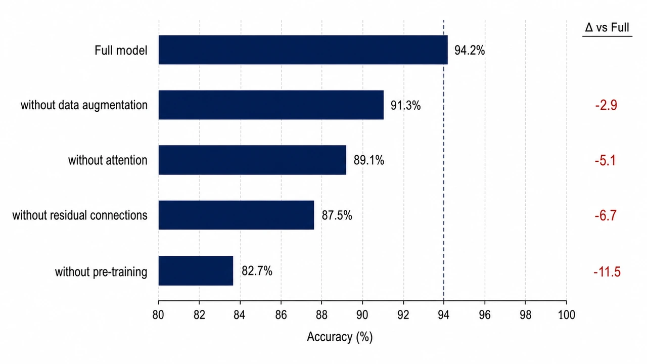
Ablation Study Horizontal Bar Chart
Sorted horizontal bars showing the contribution of each component to overall accuracy.
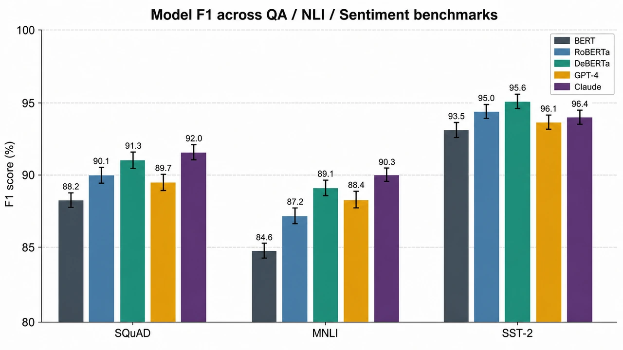
Model Benchmark Grouped Bar Chart
Publication-quality grouped bar chart comparing models across multiple benchmarks with error bars.
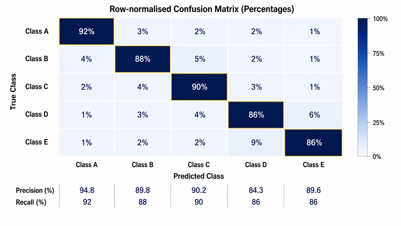
Confusion Matrix Heatmap
Square heatmap showing predicted-vs-true counts with row-normalised colors and value annotations.
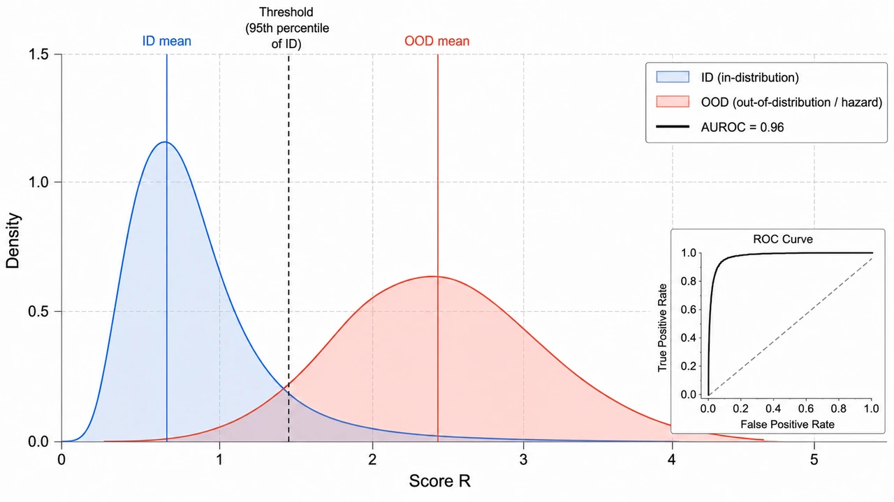
ID vs OOD Score Distributions
Two overlapping kernel density curves showing ID/OOD separability with mean markers and threshold line.
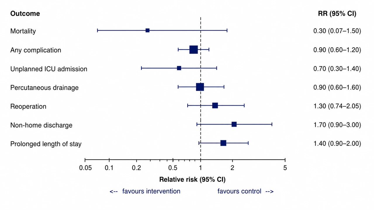
Clinical Outcomes Forest Plot
Forest plot of relative risks with 95% CI for surgical complications.
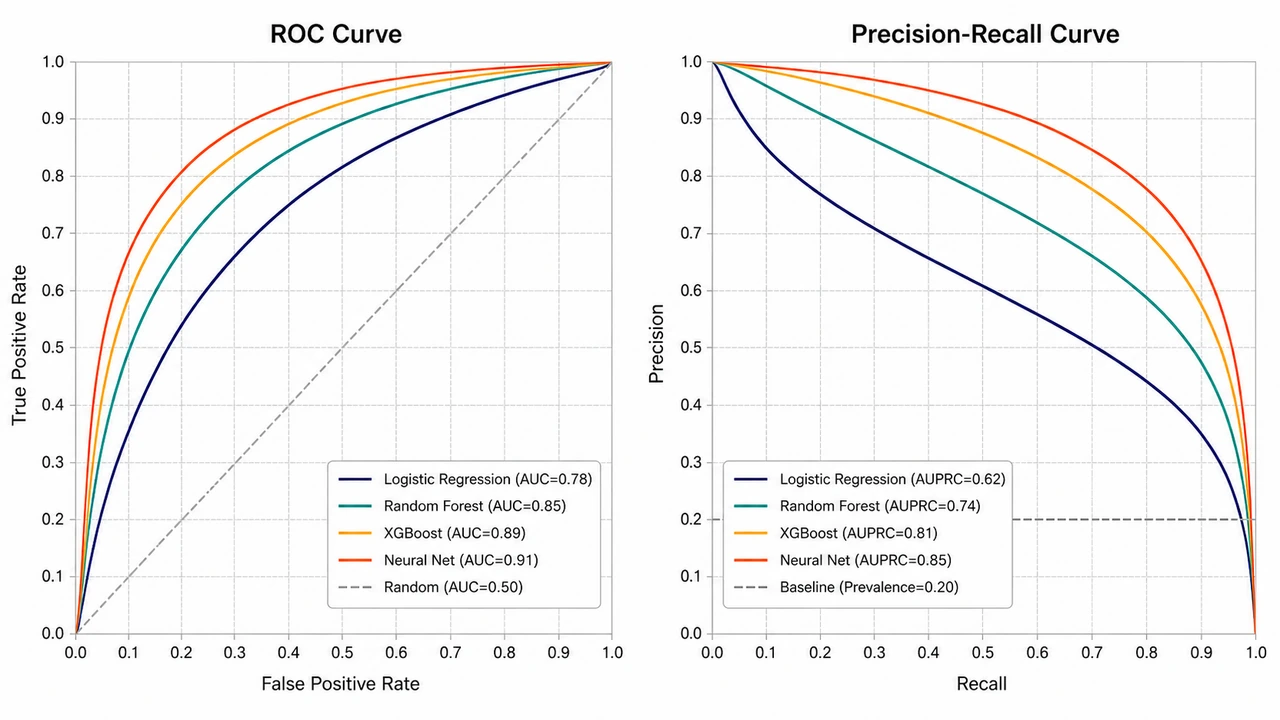
ROC and Precision-Recall Curve Overlay
Two-panel ROC + PR curves overlaying multiple models on one chart for comparison.
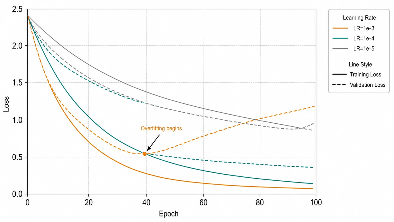
Training & Validation Loss Curve
Multi-LR loss curve over epochs with overfitting clearly visible on the high-LR run.
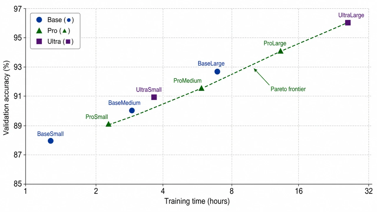
Training Time vs Accuracy Trade-off
Scatter plot of training time (x) vs validation accuracy (y) with Pareto frontier highlighted.